I don’t know about you, but the end of the year always brings up a lot of what-ifs and what’s next rumination. This year is no exception.
As we tally up what worked and what didn’t, it was clear that what helped businesses communicate most clearly were strategies that were centered on data and storytelling.
So, to help us prepare for the new year, we looked industry-wide and performed a practical, insight-led review of 100 services, retail, consulting, and trades businesses.
We evaluated:
- Content clarity
- Messaging consistency
- Navigation & structure
- Data signals (traffic, bounce rates, click patterns where available)
- Conversion pathways
Surprising patterns emerged — some inspiring, some concerning, all fixable.
The patterns we uncovered were similar to those found in our own review. That clarity drives performance, and that clarity comes into play with a focus on data-driven storytelling.
Clarity: What Fell Short
When you spend enough time studying how small businesses show up online, you start to see why certain brands thrive while others stall.
Below are the five themes that came up repeatedly and signal where they struggle. And where clarity, story, and intention could transform the experience entirely.
1. Most Websites Aren’t Telling a Clear, Human Story
Across the majority of sites we reviewed, the biggest absence wasn’t design or functionality, it was narrative. Many businesses introduce themselves, but very few share a story that helps a visitor understand who they are and what they stand for.
2. Calls-to-Action Are Often an Afterthought
A surprising number of websites feel like they’re waiting for visitors to make the first move:
- Buttons blended into the page.
- CTAs were vague (“Learn More”) or hidden.
- Some sites don’t guide the visitor anywhere at all.
What we saw repeatedly is that clarity doesn’t just help the user; it helps the business step into its own authority.
3. Navigation Is Built for the Business, not for the Visitor
Many websites revealed something subtle but important: business owners are often too close to their own structure.
They name pages based on internal language, not user intention. They organize content the way they see their work, not the way a new visitor would try to understand it.
4. About Pages Often Hide the Best Material
Nearly every business had something compelling in its story. But too often, that richness is tucked away beneath generic statements, long timelines, or formal introductions that never quite reveal the heart of the brand.
5. Visual Hierarchy Is Underused (Design Isn’t Doing Enough Work)
One of the clearest trends across the 100-site sample was the absence of intentional hierarchy, which should draw the user’s eye toward where to go first.
When everything has the same visual weight, nothing truly stands out. We saw:
- Identical font sizes
- Tightly packed text
- Muted or competing colors
- Unclear section breaks
Even strong copy loses its impact without contrast and pacing.
Focus: Standout Sites Had Intentional Message
Across a hundred business websites, a handful stood out. Not because they had the biggest budgets or the fanciest branding, but because they felt intentional.
The most effective sites weren’t necessarily fancy or long. They were honest and focused. They made visitors feel like they understood the people behind the company, not just the company itself.
These sites shared five traits:
- A distinct, human-centered message
- A cohesive brand voice across every page
- A clear, intuitive structure based on user behavior
- Data-informed choices
- A story strong enough to anchor the entire experience
When these elements align, even the simplest website feels magnetic.
Results: Continuing to Do What Works
We know that these trends aren’t theory. They’re the result of a year spent deep in client conversations, audits, analytics, and story-building.
We’ll continue to use these with our clients to help them stay clear, relevant, and competitive in 2026.
Looking ahead, we will continue to:
- Tell authentic origin stories
- Make websites more interactive
- Clean up design for clarity
- Boost mobile experiences
- Understand and interpret nuances in analytics
Looking at standout sites, we can continue to shift from crowded pages to calmer, more intentional layouts.
The patterns we uncovered this year reaffirm what we see every day in our work with clients: A sharpened message and structure that is rooted in story gets results.
Moving Into the New Year with Intention
As we step into a new year, one thing is clear: small businesses don’t need more noise. They need more intention.
At Lucid, our digital marketing strategy always has revolved around helping businesses communicate with purpose. We combine analytics with narrative, design with insight, and strategy with the kind of clarity that turns casual visitors into committed customers.
Whether we’re refining a homepage, reshaping a brand story, or guiding a full content strategy, our work always circles back to the same core principles.
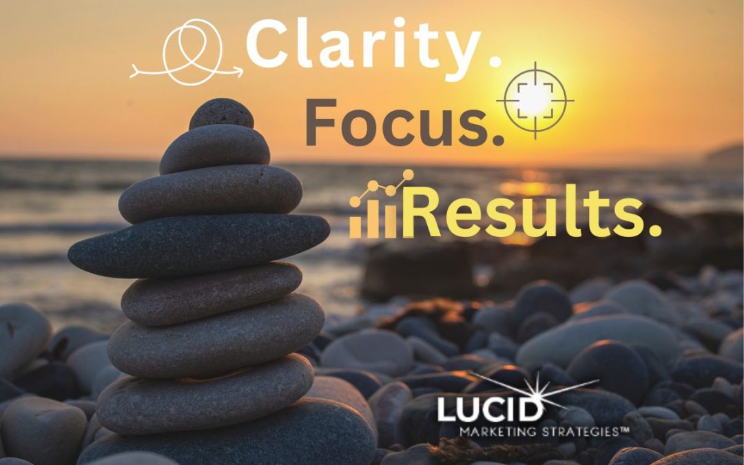
Clarity. Focus. Results.
That’s the mantra we’re carrying into 2026, and the promise we bring to every client ready to grow with intention.